
Viewports
# Index
# Description
# Why Are Viewports Important?
# Viewport vs Screen Resolution
# Actual Difference
# Mobile Example
# Screen Resolution vs Viewport
# Desktop Example
# Mobile Viewports
# Viewport Units
# Responsive Design Uses Viewports
# Common Viewport Widths
# Why Developers Care More About Viewports
# Common Misconceptions
# Description:
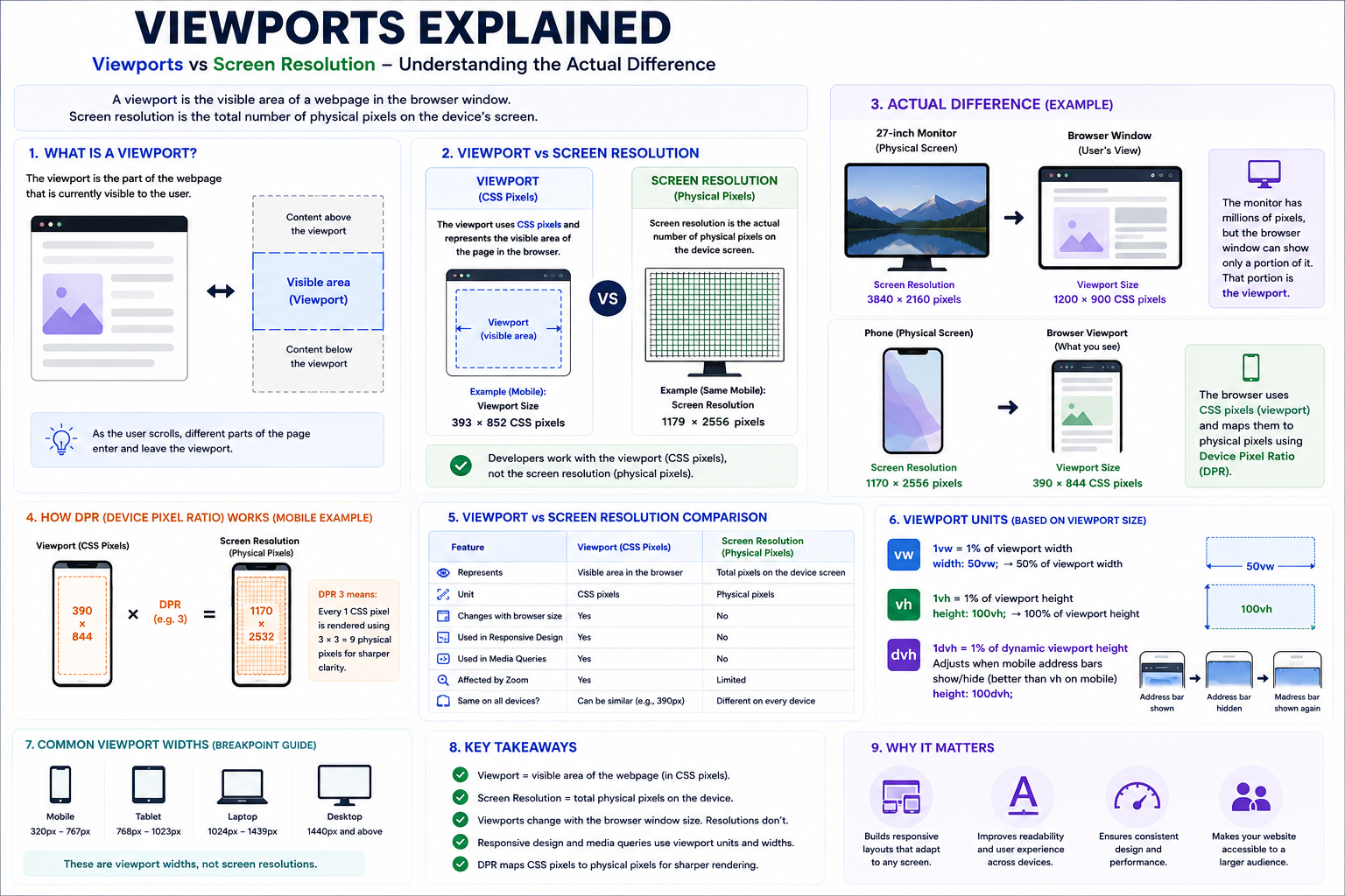
A viewport is the visible area of a webpage within a browser or application window. It determines how content is displayed and is one of the most important concepts in responsive web design. Although screen size and screen resolution describe the physical characteristics of a device, the viewport represents the area available for rendering content. Understanding the difference between viewports and screen resolutions is essential for building responsive applications that work across various devices.
# Why Are Viewports Important?
Viewports determine:
- Content layout
- Responsive breakpoints
- Font sizes
- Media queries
- Image scaling
- Element positioning
Responsive design is based on viewport dimensions rather than physical screen resolutions.
# Viewport vs Screen Resolution
These terms are often confused, but they are completely different.
Screen Resolution
Screen resolution represents the actual number of physical pixels on a display.
Example: iPhone 16 Pro, Physical Resolution: 1179 × 2556 pixels
Viewport
The viewport uses CSS pixels and represents the visible area available to the browser.
Example: Viewport: 393 × 852 CSS pixels
Web developers usually work with viewport dimensions, not physical pixels.
# Actual Difference
Suppose you have:
27-inch Monitor
Physical Resolution: 3840 × 2160
Browser Window: 1200 × 900
The browser only sees: Viewport = 1200 × 900
The remaining screen space belongs to:
- Browser tabs
- Toolbars
- Operating system UI
- Other windows
# Mobile Example
Phone Resolution: 1170 × 2532
Viewport: 390 × 844
Why?
Because modern devices use device pixel ratios (DPR).
For example:
- 390 × 3 = 1170
- 844 × 3 = 2532
Three physical pixels are used for each CSS pixel.
This makes text and images appear sharper.
# Screen Resolution vs Viewport
| Feature | Screen Resolution | Viewport |
|---|---|---|
| Physical Pixels | Yes | No |
| CSS Pixels | No | Yes |
| Changes With Browser Window | No | Yes |
| Used In Responsive Design | No | Yes |
| Used In Media Queries | No | Yes |
| Affected By Zoom | Limited | Yes |
| Represents Entire Display | Yes | No |
# Desktop Example
Monitor: 2560 × 1440
Browser window: 1280 × 800
Viewport: 1280 × 800
If the browser window is resized: 900 × 800, the viewport changes immediately.
The monitor resolution remains: 2560 × 1440
# Mobile Viewports
Without a viewport setting, browsers may assume desktop widths.
This often causes:
- Tiny text
- Zoomed-out pages
- Broken layouts
Modern pages typically include:
<meta name="viewport" content="width=device-width, initial-scale=1.0"/>
This tells browsers:
- Use the device width.
- Start with 100% zoom.
# Viewport Units
CSS provides units based on viewport size: vw, vh, dvh
Viewport width i.e. width: 50vw;
Means: 50% of viewport width.
Viewport height i.e. height: 100vh;
Means: 100% of viewport height.
Dynamic viewport height i.e. height: 100dvh;
Useful for mobile browsers where address bars expand and collapse. Modern browsers increasingly recommend dvh over vh.
# Responsive Design Uses Viewports
Media queries depend on viewport width.
@media (max-width: 768px) {
.container {
flex-direction: column;
}
}
This doesn't mean: If the phone has 768 pixels.
It means: If the viewport width is 768 CSS pixels or smaller.
# Common Viewport Widths
| Device Category | Typical Viewport Width |
|---|---|
| Mobile | 320–767px |
| Tablet | 768–1023px |
| Laptop | 1024–1439px |
| Desktop | 1440px+ |
Notice that these are viewport widths, not screen resolutions.
# Why Developers Care More About Viewports
Users don't browse the web in physical pixels.
They browse through a browser window.
Therefore:
- Layouts respond to viewport width.
- Breakpoints use viewport dimensions.
- Flexbox and Grid depend on viewport space.
- Media queries target viewport sizes.
Physical resolution is mostly handled by browsers and device pixel ratios.
# Common Misconceptions
Bigger Screen Means Larger Viewport
Not always.
A browser window can occupy only part of a large screen.
Screen Resolution Determines Breakpoints
False.
Breakpoints are based on viewport width.
Responsive Design Targets Devices
Modern responsive design targets viewport ranges, not specific devices.
Article Metadata:
Published Date: 2026-06-28
Updated Date: 2026-06-28
About the Author: Team absequ is a group of engineers and researchers working on real-world systems, software development, and technology solutions.